The Psychology of Color in Art
Color is one of the most powerful tools in an artist's arsenal, capable of evoking specific emotions, creating visual harmony or tension, and communicating meaning beyond words. This article explores the fascinating relationship between color and human psychology, and how artists throughout history have leveraged this connection to create compelling visual experiences.
The Science of Color Perception
To understand color psychology in art, we must first acknowledge the physiological basis of color perception. Unlike sound or touch, color doesn't exist as an independent physical property but rather as a perception created by our brains interpreting different wavelengths of light.
The human eye contains specialized cells called cones that respond to different wavelengths of visible light. These signals are processed by our visual cortex, creating the sensation of color. This biological foundation means that while color perception has some universal aspects, it's also influenced by personal experience, cultural context, and even genetic variations.
"Color is a power which directly influences the soul. Color is the keyboard, the eyes are the hammers, the soul is the piano with many strings."
— Wassily Kandinsky
Emotional Responses to Color
Research in color psychology has identified general patterns in how colors tend to affect human emotions and behavior. While individual and cultural variations exist, certain associations appear relatively consistent across populations:
Red: Passion, Energy, and Urgency
Red stimulates the senses and can increase heart rate and breathing. It's associated with intense emotions ranging from love and passion to anger and danger. In art, red commands attention and creates visual emphasis. Think of Matisse's vibrant "The Red Studio" or the dramatic red cloaks in Renaissance paintings symbolizing both power and sacrifice.
Blue: Calmness, Trust, and Depth
Blue tends to have a calming effect on viewers, lowering blood pressure and respiration rates. It conveys reliability, stability, and introspection. Yves Klein's obsession with ultramarine blue led to his development of International Klein Blue, which he believed captured the immateriality of space. Picasso's Blue Period works used cool blue tones to evoke melancholy and contemplation.
Yellow: Optimism, Clarity, and Caution
Yellow stimulates mental activity and is associated with optimism, energy, and clarity of thought. It's the most visible color in the spectrum and can create feelings of warmth and cheerfulness. Van Gogh's sunflower paintings use yellow to convey life-affirming energy, while his yellow house represented hope and new beginnings.
Green: Growth, Harmony, and Renewal
Green occupies the center of the visible spectrum and requires minimal eye adjustment, creating a sense of balance and ease. Associated with nature, growth, and renewal, green has been used by landscape painters to create pastoral scenes that evoke tranquility. Green also carries cultural associations with fertility, luck, and in some contexts, illness or envy.
Purple: Creativity, Spirituality, and Luxury
Historically rare and difficult to produce, purple has long been associated with royalty, luxury, and spirituality. It combines the energy of red with the stability of blue, creating a sense of mystery and contemplation. Contemporary artists like Mark Rothko used deep purples in his color field paintings to create meditative, almost transcendent viewing experiences.
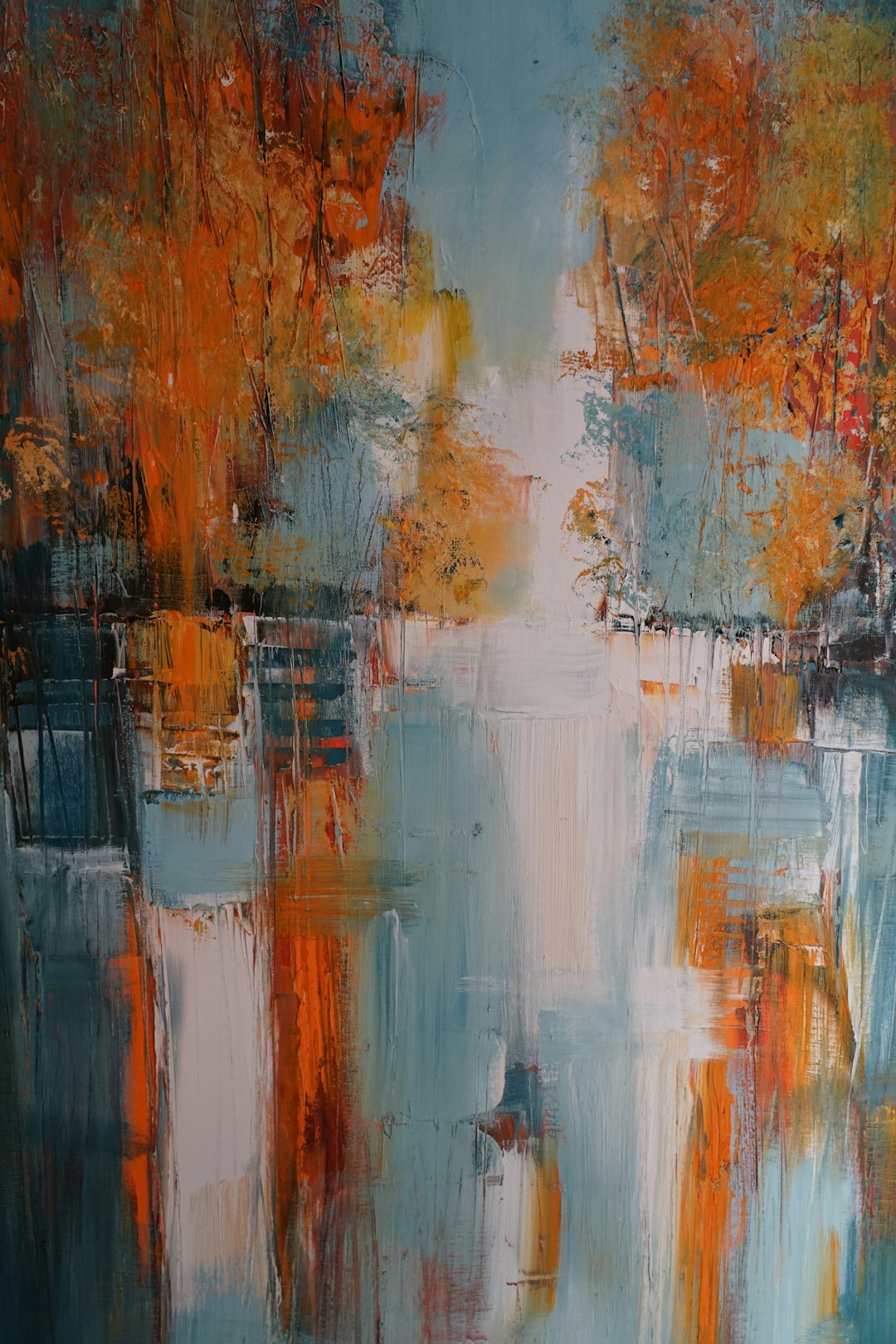
Orange: Enthusiasm, Creativity, and Stimulation
Orange combines the energy of red with the cheerfulness of yellow, creating a sense of enthusiasm, creativity, and stimulation. It's often used to create a sense of warmth and vibrancy. Kandinsky considered orange "a red brought nearer to humanity" and used it to represent health and vitality in his abstract compositions.
Black and White: Contrast, Clarity, and Extremes
Though technically not colors but values, black and white create powerful psychological effects. White suggests purity, simplicity, and space, while black conveys sophistication, power, and mystery. The interplay between these extremes creates dramatic contrasts that have been exploited in everything from Asian ink wash paintings to Western minimalist art.
Cultural and Historical Dimensions
While some color associations appear to have biological foundations, many are shaped by cultural contexts and historical developments. For instance:
White symbolizes purity and innocence in Western traditions but represents mourning and death in many Eastern cultures. The historical scarcity of purple dye, extracted from thousands of rare sea snails, made it exclusive to royalty and clergy in ancient Rome, establishing associations with power and spirituality that persist today.
Colors can also carry political significance. The Russian avant-garde employed red not just for its visual impact but for its revolutionary associations. And during the Renaissance, ultramarine blue (made from ground lapis lazuli) was more expensive than gold, so its use in paintings of the Virgin Mary signified both spiritual importance and material value.
Color Harmony and Composition
Beyond individual color psychology, artists manipulate relationships between colors to create specific effects. Color theory provides frameworks for understanding these interactions:
Complementary Colors
Colors opposite each other on the color wheel (like red and green, blue and orange) create maximum contrast and visual vibration when placed adjacent to each other. Impressionists like Monet used complementary colors to create visual excitement, placing orange boats against blue water or purple shadows alongside yellow sunlight to make each color appear more intense.
Analogous Colors
Colors adjacent on the color wheel create harmonious, unified compositions with less tension. Turner's atmospheric seascapes often employ analogous color schemes of blues, greens, and purples to create a sense of cohesive mood and atmosphere.
Color Temperature
The perception of colors as "warm" (reds, oranges, yellows) or "cool" (blues, greens, purples) significantly affects composition. Warm colors appear to advance toward the viewer while cool colors recede, creating spatial depth. This principle is evident in landscape paintings where cool blues create distant mountains while warm greens and browns establish the foreground.
Strategic Uses of Color in Art History
Emotional Expression
The Expressionists deliberately distorted natural color to convey emotional states. Edvard Munch's "The Scream" uses sickly oranges and reds in the sky to create a sense of anxiety and distortion, while Kirchner's street scenes employ acid greens and pinks to convey urban alienation.
Symbolic Communication
Medieval and Renaissance artists employed color symbolically within established conventions: blue for divinity, red for Christ's sacrifice, gold for heavenly light. These color codes functioned as a visual language that communicated to largely illiterate audiences.
Spatial Organization
Post-Impressionists like Cézanne used color to organize space and create structure, employing cool colors to push planes back and warm colors to bring them forward, creating depth without traditional perspective.
Pure Emotional Impact
Abstract Expressionists like Mark Rothko created immersive color field paintings designed to envelop viewers in pure chromatic experience. His large canvases of luminous, floating rectangles of color create contemplative, almost spiritual viewing experiences through color alone.
Contemporary Applications
Today's artists continue to explore color psychology with new tools and approaches:
Light-Based Art
Artists like James Turrell and Olafur Eliasson create immersive installations using colored light that alters perception and creates transcendent spatial experiences. These works leverage the direct impact of colored light on our visual system to create powerful psychological effects.
Digital Explorations
Digital artists can create colors that wouldn't be possible with traditional pigments, extending the color gamut beyond previous limitations. Interactive digital installations can also respond to viewers, creating dynamic color relationships that evolve in real-time.
Therapeutic Applications
The understanding of color psychology has led to applications in art therapy, where specific colors are used to influence mood and emotional states. These approaches recognize the profound impact color can have on our psychological well-being.
Practical Applications for Artists
For contemporary artists looking to harness color psychology effectively:
- Consider the emotional response you want to evoke before selecting your palette
- Be aware of cultural contexts and how they might influence interpretation of your color choices
- Use color contrast and harmony strategically to guide the viewer's eye and create emphasis
- Experiment with limited palettes to create cohesive emotional experiences
- Recognize that color relationships often matter more than individual colors
Conclusion
Color is never neutral—it speaks directly to our emotions, shapes our perception of space, communicates cultural meanings, and creates powerful psychological effects. By understanding the psychology of color, artists can move beyond intuitive color use to strategic application that enhances their visual communication.
As Kandinsky noted, color is a direct line to the soul, bypassing rational thought to create immediate emotional and perceptual experiences. Whether through harmonious relationships that soothe the viewer or jarring contrasts that provoke and challenge, the thoughtful application of color psychology remains one of the most powerful tools in the artist's repertoire.